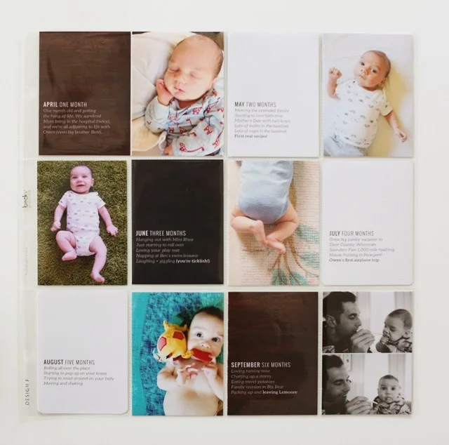
A Simple Project Life Title Page
I'm still working my way through Owen's baby album, but he turns one later this month, so I decided to put together a title page for the album that recaps the year. I remembered seeing this concept ages ago on Paislee Press.
Sure enough, I was able to track down Liz's original post (over three years old!) that inspired this layout. Today I'm sharing my take on a simple title page that recaps the year.
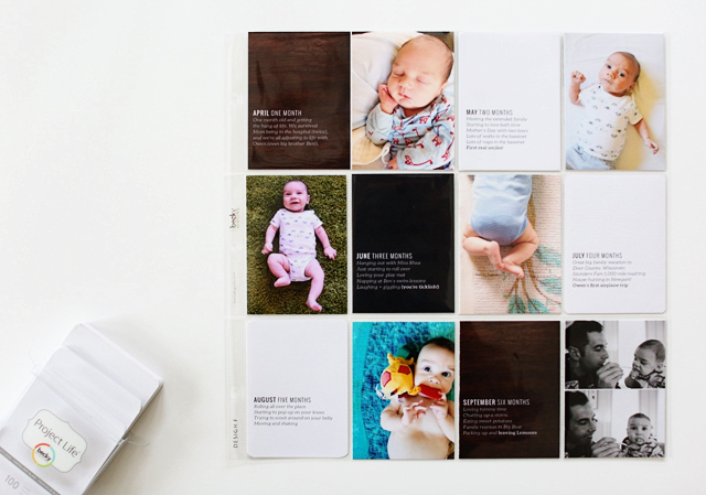
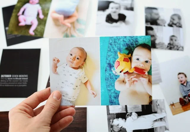
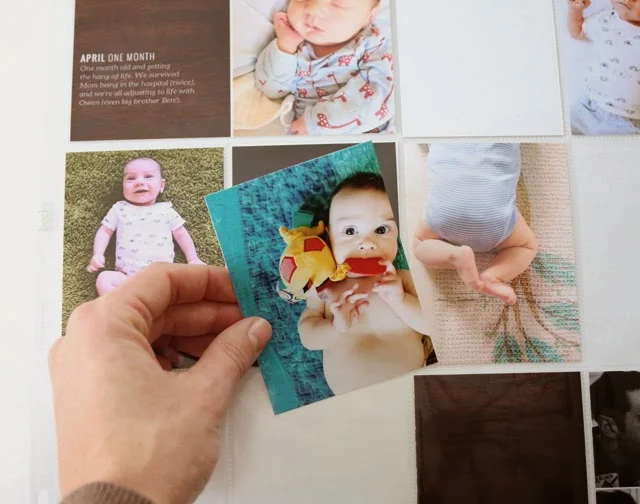
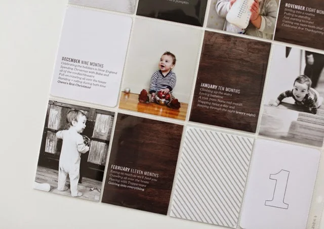
I used the Design F pocket page, which has lots of 3x4 pockets and one 4x6 pocket. I used these templates (they're free!) to lay out two photos on one 4x6 so I could print them easily. I picked a photo from each month and tried to mix up the orientation or cropping so they wouldn't be too similar. I would have loved to take the same shot setup every month, but... I wasn't that organized! You've seen the front of the layout.
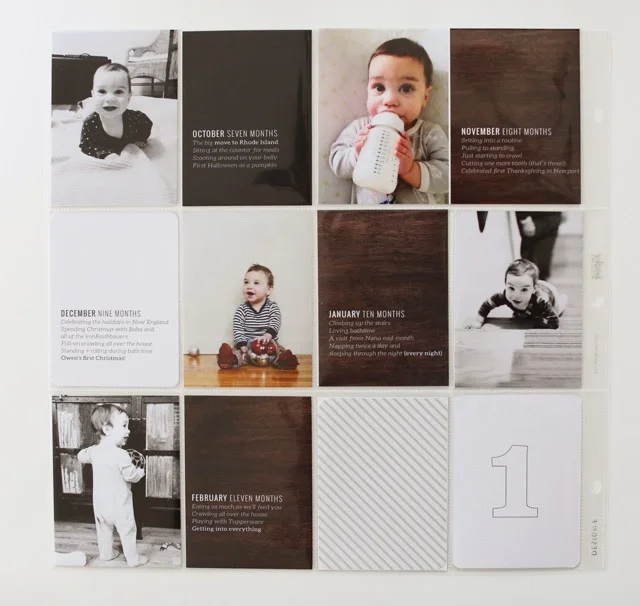
Here's the flip side.
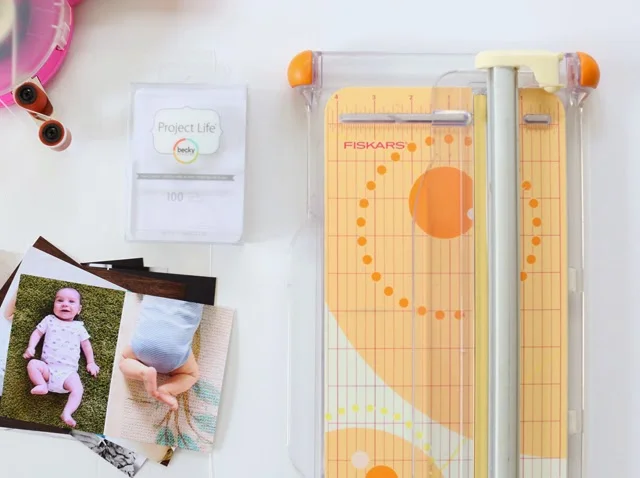
Supplies were pretty simple.
Here's what I used:
- + 12 3x4 photos: one from each month of Owen's first year
- + 12 3x4 journaling cards: mine are a mix of digital products (here + here) and plain white cards
- + 2 4x6s: in the Design F pocket page, one of the pockets is a 4x6, so you have to combine two of the photos with journaling and make sure they're for the right month for that spot! (and then be careful not to cut them in half!)
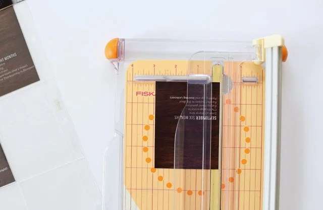
- + a paper trimmer and some two-sided adhesive
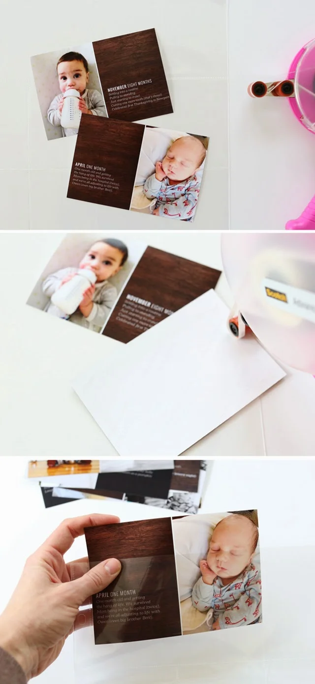
Before I started cutting the 4x6s in half, I pulled out the two that needed to stay intact, since there's one 4x6 pocket to fill on each side. The "April" and "November" slots would fill the 4x6 on the front and back, respectively, so I stuck them together with adhesive and slipped them in the pocket to get them out of the way. I've made that mistake before - cutting something I didn't intend to cut - so I wanted to get these pics in the pockets so I'd leave them alone!
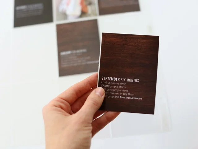
Then I got to work and cut the rest of the 4x6s in half. Some of the photos I printed contain journaling on either these woodgrain cards or the dark paper from this digital kit. I laid everything out on both sides so I knew which photos would be back-to-back in the pockets.
One way I keep my pocket pages looking clean and simple is by matching up the cards and photos that are back-to-back in each pocket. I start by laying everything out, then using my favorite two-sided adhesive to stick the two photos or cards together. Sometimes one is a little larger than the other.
Like the crazy person I am, I'll trim that little bit so the cards line up exactly. I don't always do this, but let's be honest - I do it a lot of the time. I know it's nuts.
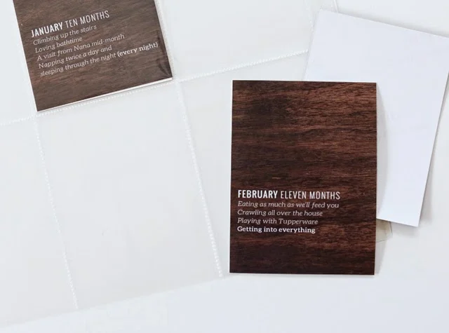
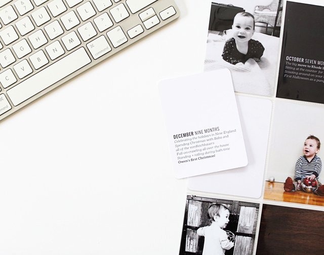
On each side of the layout, I included just a few of the patterned journaling cards so I could fill in the missing journaling with plain white 3x4 cards.
I added the same text format on the white cards and printed them at home.
I'm waiting to add a 12 month photo until we have a birthday cake shot, or something along those lines. For now, I just added a patterned placeholder.
And here's the finished page again on the front
and the back.
It's unbelievable how much they change in a year. I love having all these photos of Owen in one spot. It has me wanting to go back and put one of these together for Ben's baby album!

