photobook | week in wyoming
At the end of last summer, my husband's parents arranged for a family trip to Gros Ventre River Ranch in Jackson Hole, Wyoming. Nick's sister and her husband are on the east coast; the rest of us are out west.
So we met in the middle-ish for a week of horseback riding, fly fishing, roping, cattle sorting and cutting (yup, we did that), eating and just hanging.
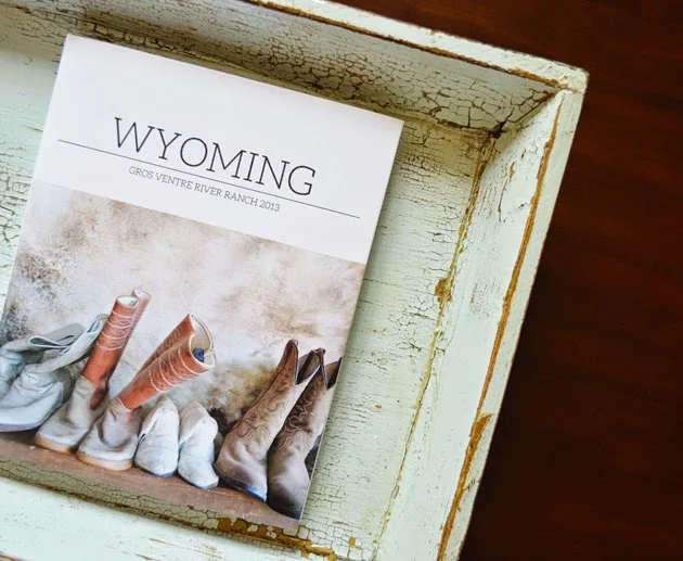
I documented the trip with a photobook from Blurb using some templates and papers from Paislee Press. This was the first Blurb book I'd ever designed, and I'm so happy with how it turned out.
I used the Adobe InDesign plug-in, which allowed me to create each page from scratch. It was time-consuming but worth it in the end. InDesign, which I'd never before used, was fairly easy to master once I got the hang of it. Today I'm sharing a few of my favorite layouts and the products I used to put this thing together (all 118 pages of it!).
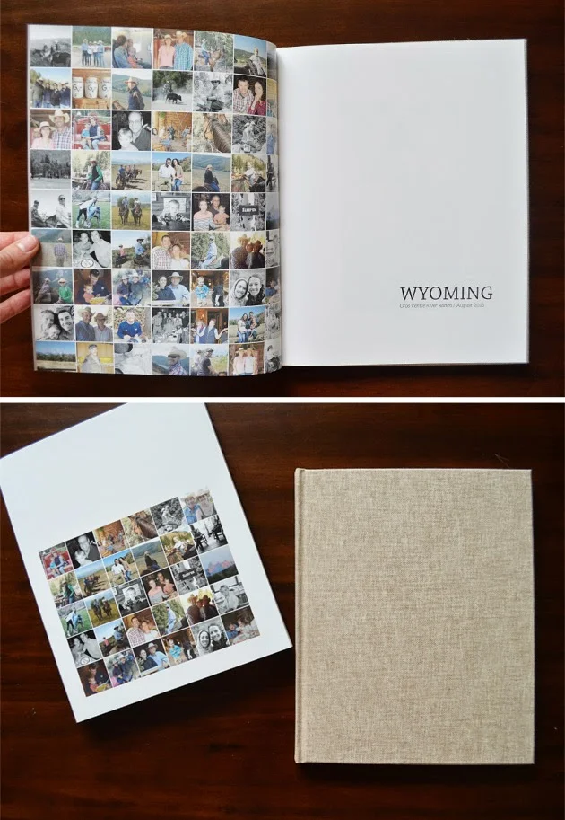
I used press plate no. 25 to create this collage of photos which appear throughout the book (63 of them, I think!) for the title page. Part of the collage also appears on the back cover of the dust jacket. I love that it's bound with book cloth. I like that Blurb offers several color options for the book cloth and the paper on the inside cover.
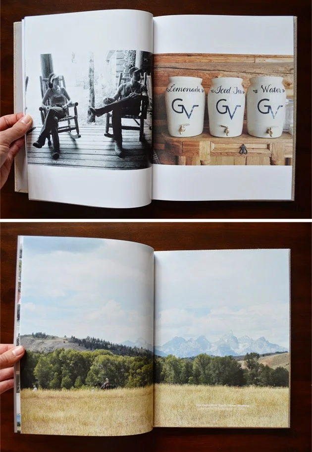
We actually snapped the majority of the photos on our iPhones. I was super impressed with the quality of how those pictures in particular printed, even when I did a full bleed two-page spread.
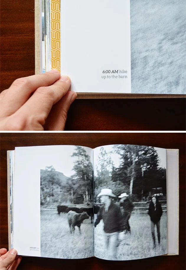
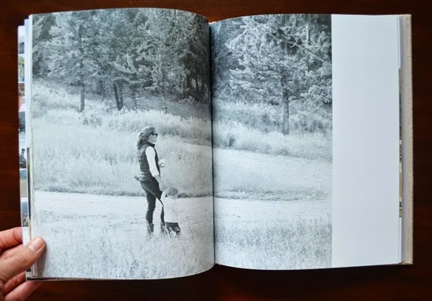
And then there are the shots that aren't perfect, like this black and white one of us walking through a field of cows to get to the barn. I'm so glad I kept it! It perfectly encapsulates what it felt like to wake up at 5:30 am on vacation to do the once-weekly early morning ride. A hot breakfast by the river made it worth the effort, but it was so cooooold and we were pretty tired!
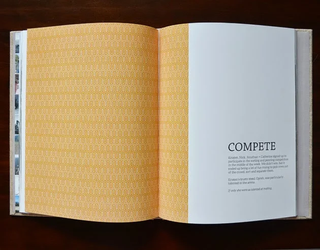
There's no table of contents, but I did break the book up into sections. I denoted each section with a title page. I used a different pattern from the Paislee Press downtime papers for each section and I added a title and a description for each (two are shown below). I love how these pages turned out.
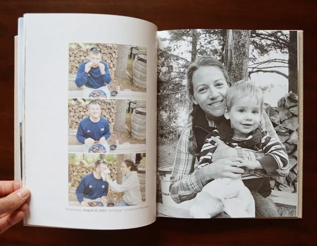
Many of the layouts are a mix of a full-bleed photo on one side and a collage on the facing page. I also like to mix color and black and white photos in the same layout, but when possible, I tried to keep the photos thematic. The layout below includes several pictures from one of the outdoor barbecues.
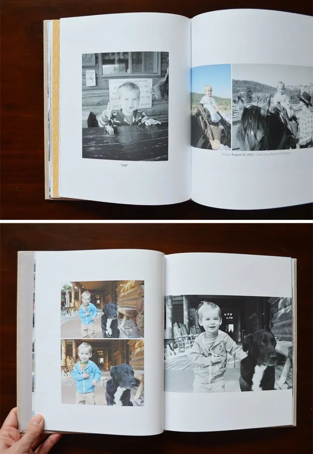
More black and white / color combo layouts (yes, I'm a fan), and lots of white space on these types of pages to balance out the full-bleed layouts.
Even when you use one huge photo, a little white space is a nice breather on the page.
The project: documenting our summer trip to the Gros Ventre River Ranch in Wyoming with photos + words
The details: Blurb 8x10 hardcover photobook / 118 pages / printed on premium matte paper
Products used: downtime papers + press plate no. 25 + a few layouts and much inspiration from off to press templates from Paislee Press / photos processed using RadLab / book designed using Blurb's FREE Adobe InDesign plug-in
Do you have any photobook projects in the works? Any favorite photobook printers? I've used Shutterfly in the past and I'm looking forward to trying out Pinhole Press, but I'll tell you I was really happy with the quality and flexibility of Blurb.

