typography
This week we're talking about typography: the art of arranging type and selecting fonts, point size, spacing, etc. Sometimes when it comes to printed projects, all you need is some clever lettering. I found this on
, which illustrates the point:

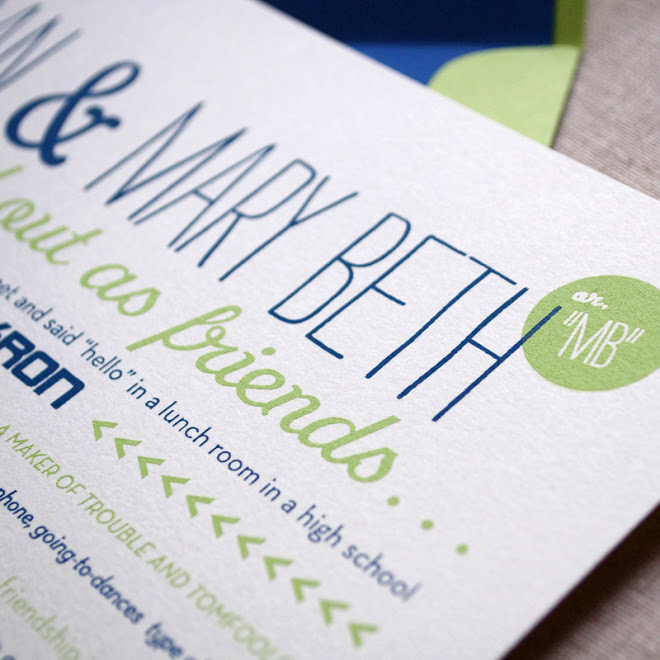
Sometimes it's not about finding the perfect font but about using a few favorites, like in this wedding invitation by
.
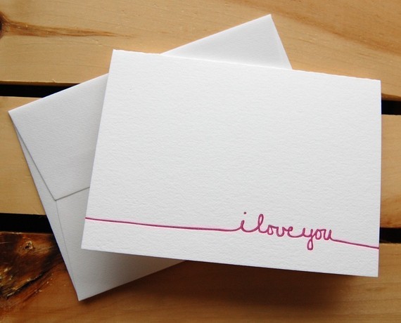
And sometimes it's about picking one little typeface and a sweet, simple message, like in this folded card from
.
You can also play with orientation of text. Change the direction, change the whole feel of the project, like in this wedding invitation by
, available on
.

I also love playing with scale, like in this artwork by
. Huge ampersand. Tiny type.

So this week we'll be visiting the topic of type. Have you found any stationery, artwork, book covers, posters, pins using interesting lettering or lettering in an interesting way? Email links to your favorites from around the web and on Pinterest to catherine@green-fingerprint.com
or
post a link in a comment this week. Once again, I'll send free stationery to the first five people who either email me a link or post a comment with a link. Happy hunting!