you're invited!
Today's post will serve as both a wrap-up for last week's exploration of typography and an intro to this week's topic: invitations. The verb invite means "to request the presence or participation of in a kindly, courteous or complimentary way." When designing an invitation, I begin with the event itself. What will be the theme? What time of day will it take place? What colors are we using? As I design each element of the invitation, I always come back to the act of inviting guests: Will the invitees not only understand the general feel of the event, but also feel like I took care in coming up with a special way to request their presence?
One of my best friends in the whole world is having a baby girl (eek!!!), and several of us are throwing a shower for her. We want to plan an event that's girly without being too fussy, just like Erin, the mom-to-be. The shower is about celebrating her, after all. So I started with this incredible Alexander Henry fabric, which is one of the nursery options.
I love love love the colors in this fabric, so the theme is COLOR US HAPPY. For the most part I only used typography for the design. I stayed away from very juvenile fonts, but I used playful verbiage, which I think keeps the invitation from being either too cutesy or too sophisticated.

Hopefully guests will pick up on the playful nature of the event, the color theme and, of course, all of the necessary information! Here are some close-ups of the invitation:
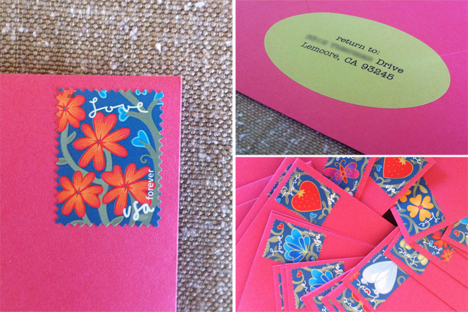
I also like to pay close attention to the envelope, which is the first thing your invitees will see. The colors of the envelope and address label should immediately begin to set the tone for the event.
Don't forget the details! These forever stamps from the post office were perfect for the invitations, and I picked up another one of the colors by using a green return address label.
Are you seeing the theme? Would receiving this invitation in the mail make you smile? I sure hope so. Next month, I'll share some photos from the event itself. And stay tuned this week. We'll be talking lots more about invitations.
Sources // Envelopes and labels are from Paper Source. Both are made with recycled content.
The paper for the invitations themselves is made from 100% post-consumer recycled content.

One of my best friends in the whole world is having a baby girl (eek!!!), and several of us are throwing a shower for her. We want to plan an event that's girly without being too fussy, just like Erin, the mom-to-be. The shower is about celebrating her, after all. So I started with this incredible Alexander Henry fabric, which is one of the nursery options.
I love love love the colors in this fabric, so the theme is COLOR US HAPPY. For the most part I only used typography for the design. I stayed away from very juvenile fonts, but I used playful verbiage, which I think keeps the invitation from being either too cutesy or too sophisticated.


