project life | photo-heavy layouts
I've been working on finishing my Project Life album for Ben's first year. My goal was to do one layout per week, and sometimes that means a photo a day. Other times, I end up with tons of great pics from the same day or event.
I gravitate toward keeping the pages simple and uncluttered, but what to do when you have a week or an event with tons of photos? How do you keep the layout from looking too busy? I realized, as I flipped through Ben's album, that a couple of patterns emerged.
Dilemma 1 // You have a ton of photos from the same day. I start by dropping all of the photos I want to include on a page into one album in iPhoto.
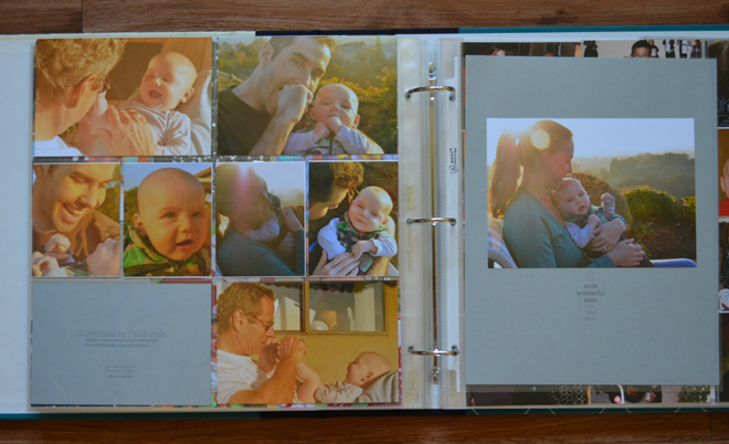
Then I go through the album and select the 11 or so photos I like best. I try to make sure there aren't any that are too different from the rest. In other words, I keep them in the same color family, which is easy if they're all shot around the same time. Here's an example from my Christmas Eve page:
This one is of Christmas morning: same lighting in all the shots, similar colors spread around the page and just one simple journal card.
This layout is also from the week of Christmas. We were up in the bay area taking pictures in my in-laws' backyard.
I selected photos that had been taken around the same time (and all of them outside), and ran every photo through the same filters in Photoshop.
This helps keep a photo-heavy page looking pretty simple.
Both Design B and Design D have space for portrait-style 4x6 photos as well as landscape-style journal cards or 3x4 photos. To get the look I did in the Christmas layouts, I used these free 4x6 templates from Paislee Press to combine two photos in one. You can download them HERE.
Project Life Design B + Design D photo pocket pages + Paislee Press 4x6 Photo Templates
Photos edited using RadLab // Click HERE for more information on Project Life


