project life | week 13
Today I'm sharing my "week 13." I'm numbering the weeks based on my pregnancy rather than the week of the calendar year.
During this particular week, I did a very very abbreviated version of Ali Edwards's week in the life project. I've never done this before, but I had a 12x12 page protector to fill and I liked the idea of doing a timeline for the week.
The timeline is really simple. I chose one or two pictures for each day. For the journaling, I wrote about highlights specific to that week as well as bits and pieces of our ordinary weekly schedule.
The insert is a horizontal 8x5 x 11 inch page protector from Becky Higgins. After I got the insert printed I realized the page protector isn't meant to be centered, which did not work for my layout. No worries. I punched a couple of new holes to create the one-long-collage effect.
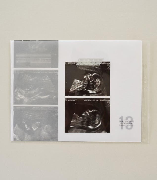
The right side includes all of my normal journaling, a few favorite photos from the week and an insert with extra photos from the ultrasound.
The journaling cards are designs I use each week. You can find details on those HERE, including fonts, sizes, etc. I print directly onto plain white journaling cards. You can find my printing process HERE. The polka-dot card is from the project life midnight edition core kit designed by Liz Tamanaha.
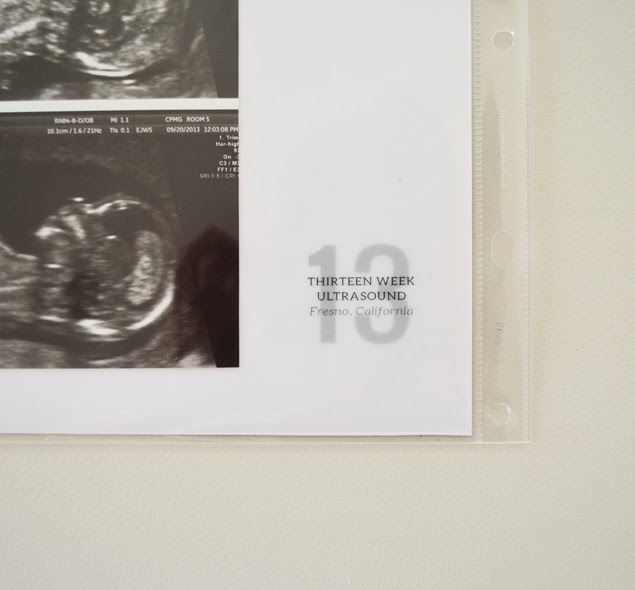
The midnight edition totally inspired the look and feel of this album: lots of neutrals, a little yellow, a mix of typed and handwritten text, organic elements, pattern, etc. The 13-week ultrasound in the lower-right corner is mounted on a project life 4x6 grid card.
To create the insert, I started with a piece of plain white 8.5 x 11 inch paper. I printed the number "13" on it in grey in the lower-right corner. Then I adhered a strip of the photos onto the left side of the white paper.
Next up: a piece of vellum printed with the ultrasound details in the same spot I printed the number "13." I adhered a couple of my favorite shots from the ultrasound to the top of the vellum with a piece of silver metallic washi tape and slid it on top of the white paper and into the page protector. I really like how the vellum makes the less-detailed ultrasound images a little muted. They're included, but not front-and-center.
Here's what the left side looks like in the album:
And the right side, album-ready:
You can read more about my project life process over at Paislee Press or check out my other project life posts HERE. For more on what inspires me, follow me on Pinterest. And please feel free to leave a comment if you have a question.


